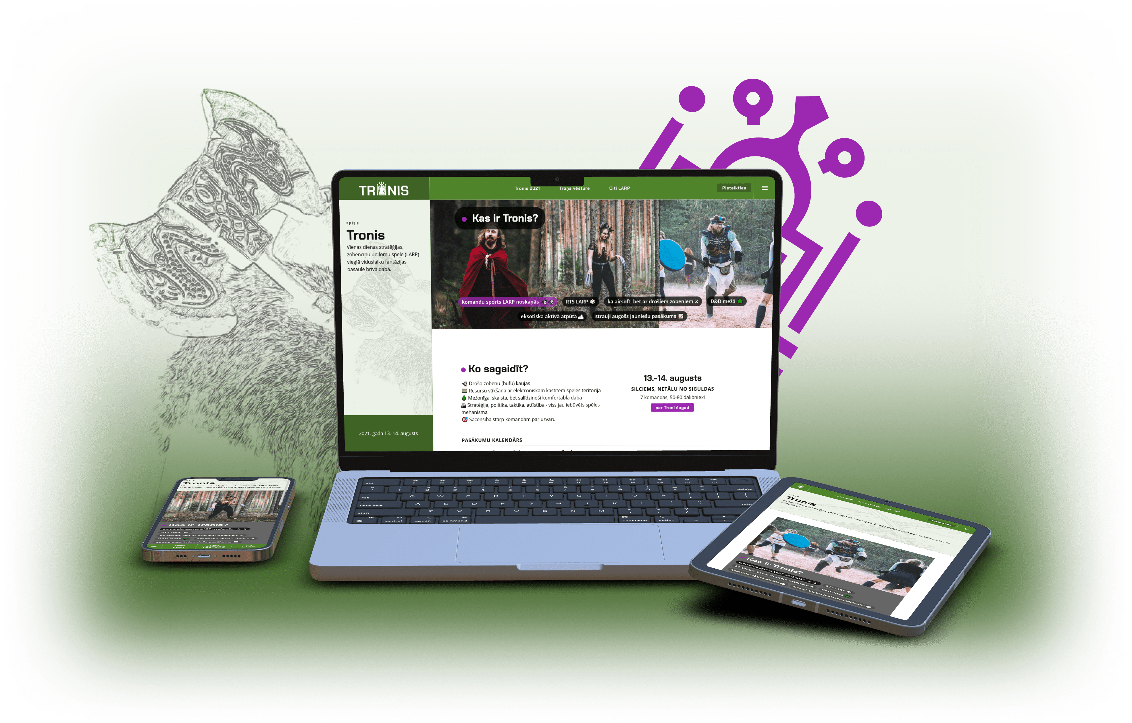
Main outcome: I designed a website to market and educate about a medieval Live Action Role Play (LARP) game in the forest.
The medieval Live Action Role Play (LARP) game Throne is the biggest LARP event in Latvia. Both the organizers and participants struggle to find organized info about LARP Throne. A well made website will help organizers educate new players, and help LARP become a more mainstream free time activity.
The organizer team set out to create a LARP Throne website. Through user experience (UX) design and development, we created a website that consolidated info about Throne and LARP in general in one place.
I led the design phase. I created most design deliverables, content and mentored a volunteer on his UX design journey. The main organizer acted as my partner by providing context and feedback. Our developers implemented the project while I helped them with quality assurance (QA).
Business requirements
Throne is the most innovative LARP in Latvia, attended by 50-100 people every year. It aims to be the LARP of choice for new players. Organizers are committed to create an easy to understand website that lowers the entry bar for new players. They are willing to develop the website themselves.
I interviewed the main organizer and through a design brief and a business needs document gained context of the website’s place in the Throne’s info ecosystem.
Website goals
- Legitimize LARP Throne as a mainstream free time activity
- Help new players understand what is LARP Throne and LARP in general
- Create a central location for content that social media backlink to
I translated the business goals into attainable objectives and validated them with the client. Insights from these conversations led me to high level priorities.
Priorities
- Focus on content so the website becomes the richest knowledge base about LARP in Latvian.
- Create a brand to position LARP Throne in the free time activity market in a coherent manner.
- Keep it simple as the knowledge about LARP varies widely. Every person entering the website should understand what it is about.
User research
With the help of the main organizer, I created user personas. We put together all contexts and reasons to visit the Throne website in user scenarios.
Goal-directed user personas
To include all user audiences, I divided them by user personas. The three personas in the first row are the main audience whose needs are more important than the other four.
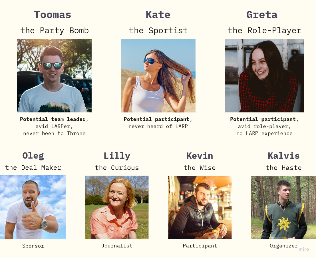
An overview of the user personas - fictitious models of a target user audience that could have a reason to visit the LARP Throne website.
The personas are chosen by their end goals, likes and behaviours. For example:
- Toomas is the heart of the party and knows everybody. When he attends events (also LARPs), he takes his friends with him.
- Kate loves movement and has tried out almost every free time activity. She easily gets excited and is always up for something new.
- Greta lives in her dream world. She loves fantasy books, everything related to Lord of the Rings and spends her social life playing table-top role-play games, such as Dungeons and Dragons.
User scenarios
Together with my design mentee we reframed each personas context and reasons to visit the Throne website into user scenarios with goals and pain points.
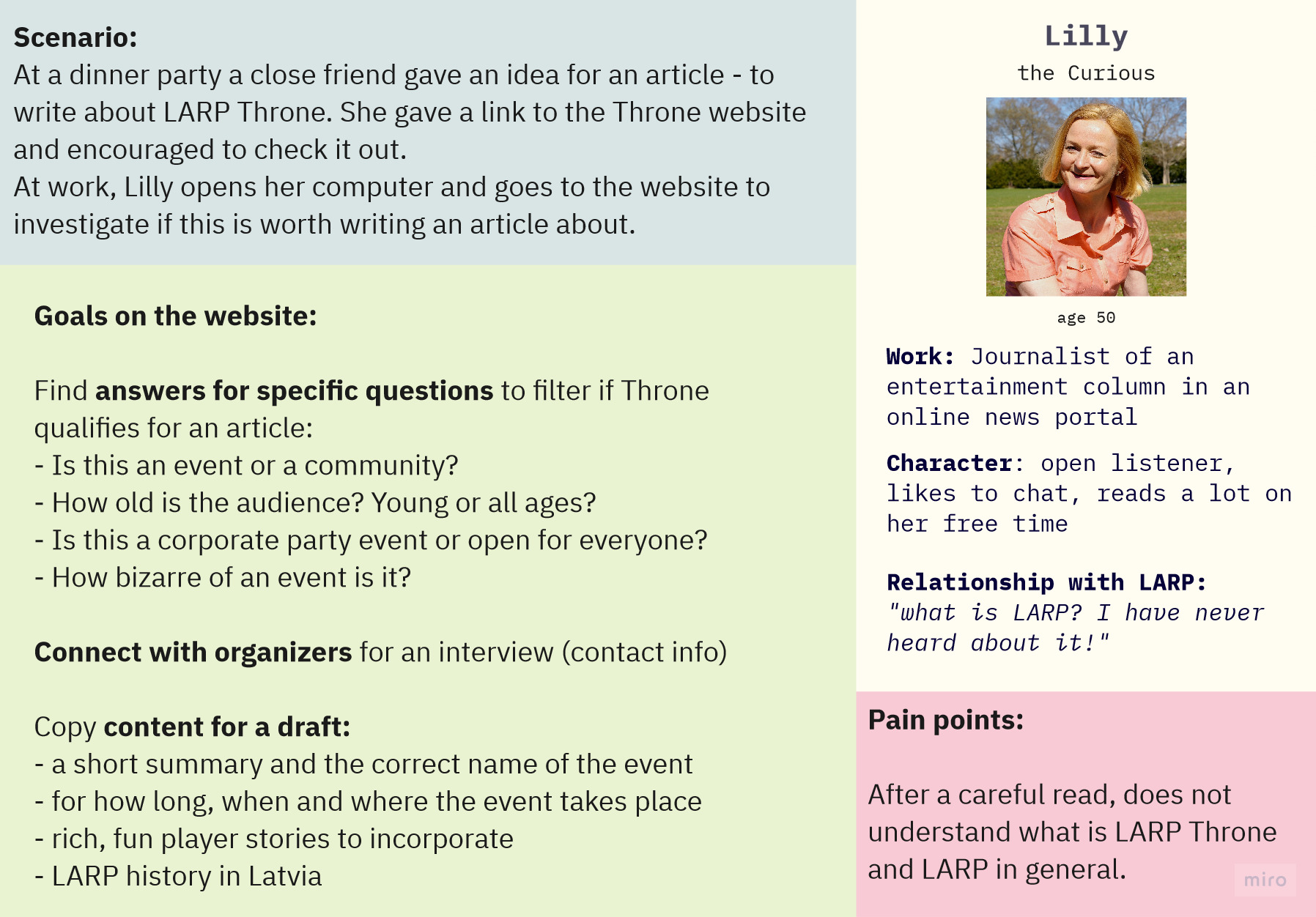
User scenario - a realistic short story of why, when and how the persona would visit Throne website.
Conclusions
Personas with scenarios was a quick way to gather high quality info as I had access to an expert who knows a lot about LARP, has previously organized Throne and has real life experience dealing with the audience.
User scenarios created a space for us to empathize with all user groups and look at the website’s goals from a more inclusive perspective. For example, a 50-year-old journalist who has no idea what is LARP should feel as welcome as participants of previous games.
Scenarios made it clear that the website should be mobile-first. For example, organizers planned to use it in swordfighting practices to quickly show where to find more info and sign up for the game.
Information architecture
Throne website is the first and only attempt to collect info about LARP in Latvian. That means, we generated content from zero. I took special care to create content that is relevant for the users in the long-term, because I suspect that the Throne website will be the main source of information about LARP in Latvia for the next few years.
In collaboration with my design mentee we cherry-picked key information from user scenarios and made an affinity map to kickstart the website’s content structure and navigation tree. I used it all to prototype the content layout.
Affinity map: key info from user scenarios
I tagged relevant keywords and content units from all 11 user scenarios. Together with my mentee and main organizer we grouped and titled them.
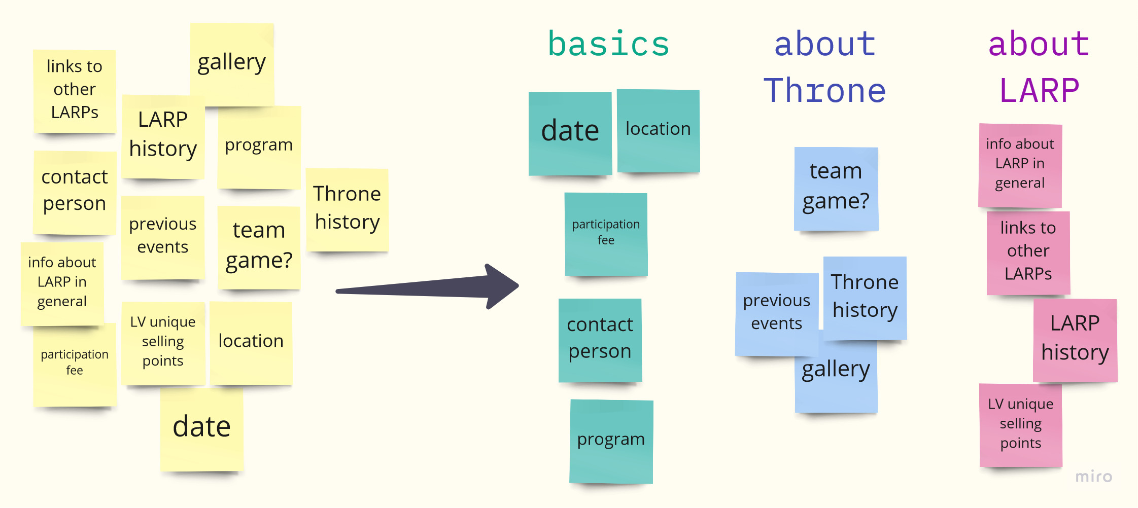
Affinity mapping - sorting content bits from persona's scenarios in titled groups.
Viewing all keywords through an affinity perspective gave us fun content ideas we did not imagine before. It also helped us distill the mandatory from the optional. For example, the group “basics” turned out to be a must-have, but “about LARP” - optional.
Navigation tree
I made a navigation tree to structure the content for a prototype. I used affinity map as a starting point, although it does not directly translate into pieces of navigation.
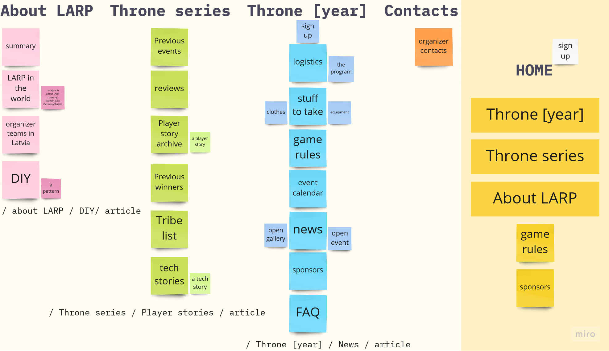
Navigation tree - all info sorted in order of priority within sections.
After a few iterations I ended up with 3 main sections that sort all info in sub-sections, pages and blocks of content. To keep it simple and mobile-friendly, I restricted the maximum depth to 3 levels: /main page/topic/article.
The resulting navigation tree keeps the website simple. From visualising it I was able to focus on the current year section as it is the biggest and most crucial for all users.
Prototype
To try out variations of placement of the content within a page I translated the navigation tree into appropriate elements like titles, text and images on a mobile screen.
During prototyping I chose the approaches for how users will navigate through the website, like navigation through content and such mobile-first principles as the bottom navigation bar.
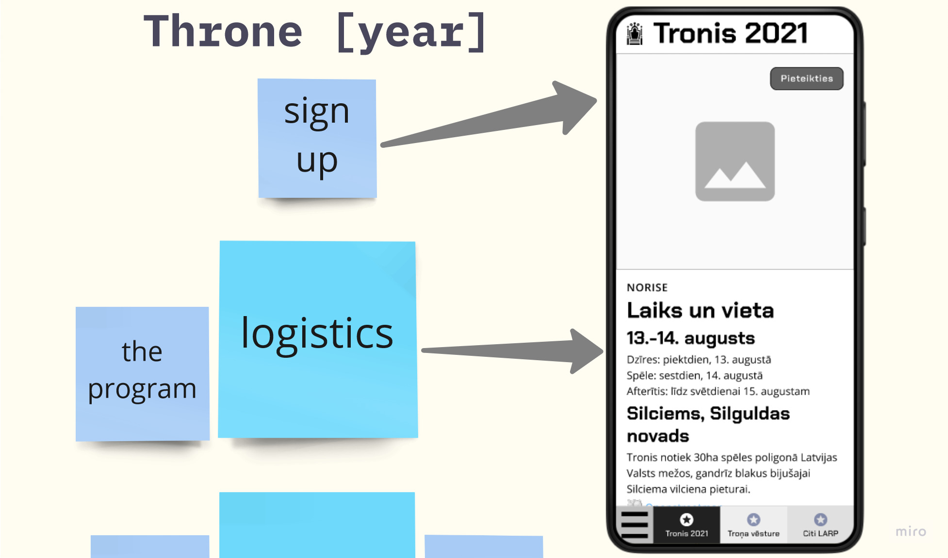
The content bits are elaborated and placed on the screen as a first prototype. Navigation tree headers are used as the bottom navigation.
Copywriting
In Throne website content is the king.
But, there is no existing source of information about Throne or LARP in Latvian, so I needed to generate content from scratch. This is a hard task, as the Latvian language lacks vocabulary about role-play and LARP topics - many words are not translated to Latvian and when talkling about them people switch to English.
I did my best to fill the prototype with real content. That way I enabled myself to receive feedback about the vocabulary as early as possible.
Testing the prototype
Together with my design mentee we tested Throne website prototype’s usability via Discord video calls. We made 4 moderated usability tests with users of varying familiarity with LARP: new players, experts and an organizer.
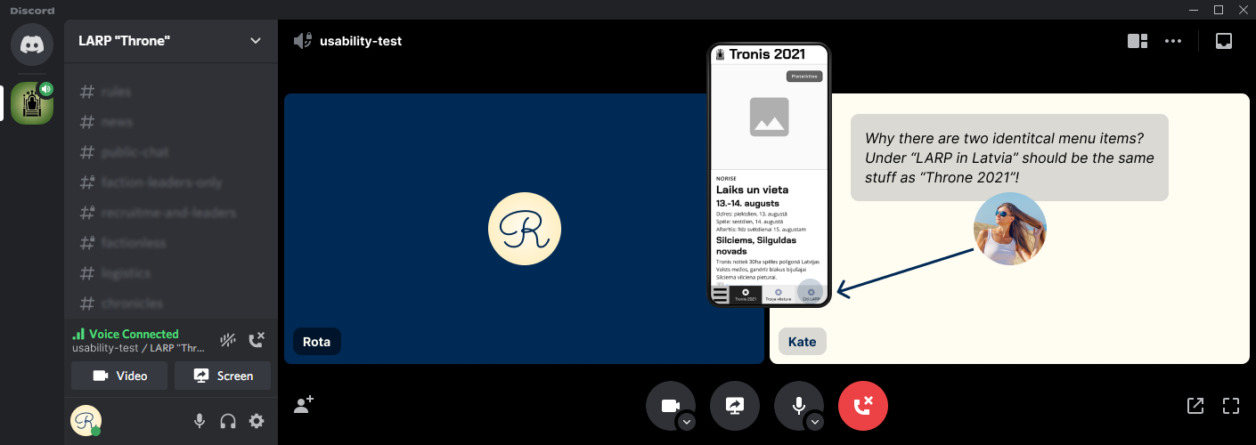
A remote usability test with an new player.
Usability tests revealed some significant problems:
- Users of various backgrounds expect different vocabulary. For example, new players need more explanations and are not familiar with acronyms, like HP (hit points) and GM (game master).
- People’s mental models differ based on their experience with LARP. For example, a new player perceives words “Throne” and “LARP” as equals, but an experienced player knows that Throne is just one of many LARP games.
As a result of usability tests, we changed the main section titles, improved wording and included even more easily digestible content. I also shortened sections and made the most important sections (game rules and logistics) more visible.
UI Design
The organizers have made LARP Throne games more than 3 times and slowly accrued visual materials such as a logo, photos and a game territory map style. Via the help of levers, I distilled the style ideas into concrete guidelines for Throne website UI design.
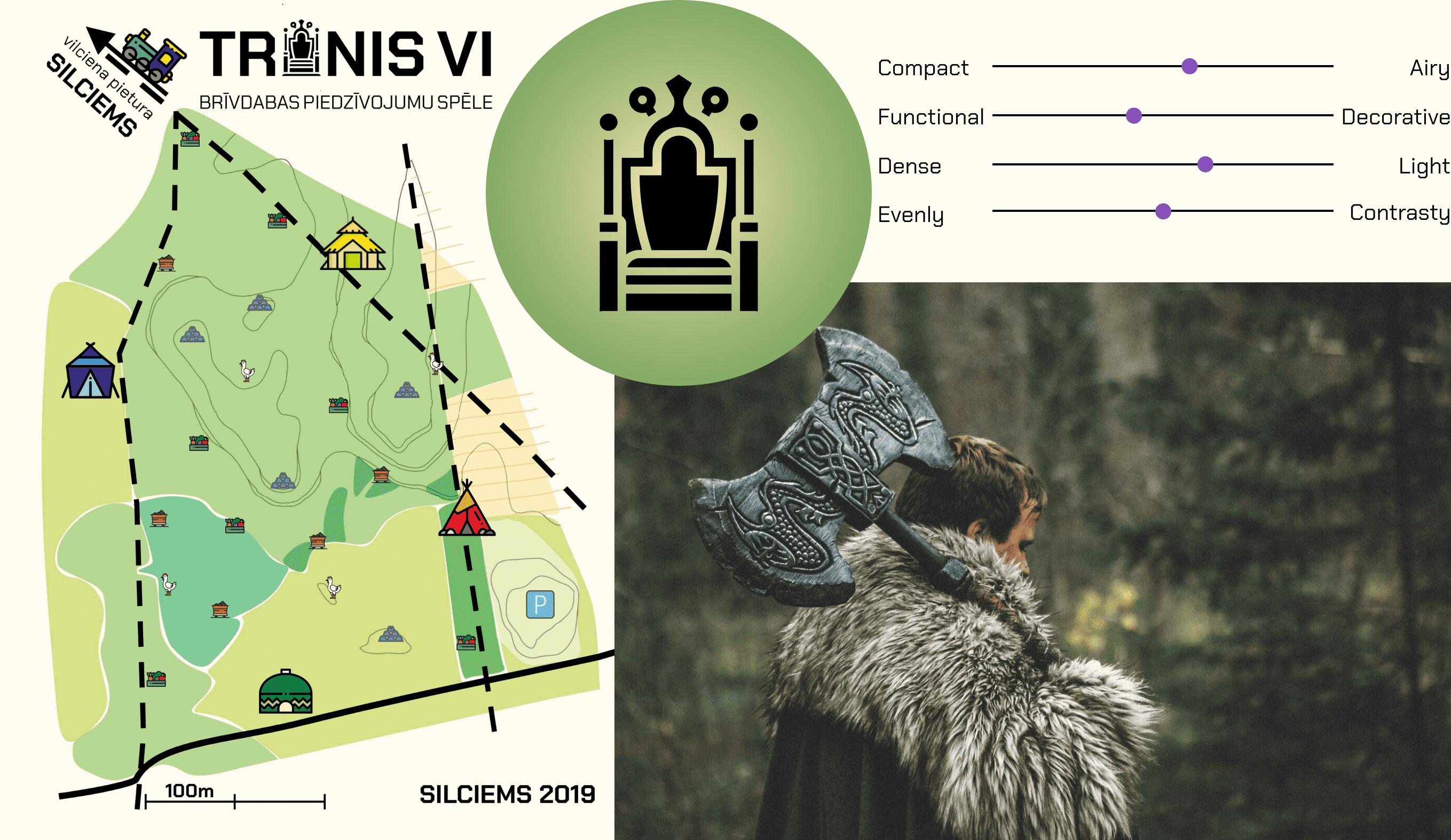
Inspiration, guidelines and branding materials for creating Throne website UI style.
Organizers wanted to convey specific messages via the website both through content and visual style. Here are examples of their needs and the UI decisions I made to meet them:
- Robust: This is a player-versus-player game for grown-ups. We aim for complexity not complicatedness.
A rugged and tough font Chakra Petch for headings. - Inclusive: Throne is a game with many layers and so accommodates a wide range of players.
Tags to the homepage that answer the question “What is Throne?” from varying depths of understanding. - Contentful: Organizers are fully transparent about everything and provide as much info as possible and useful for the players.
A side navigation UI element (on desktop) that lets users scan all page content quickly.
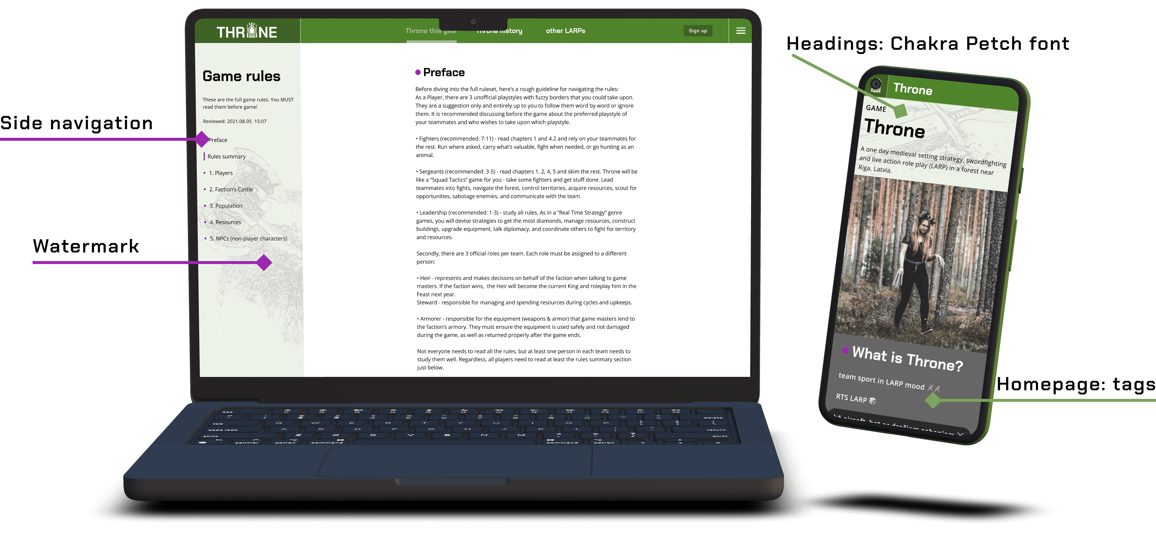
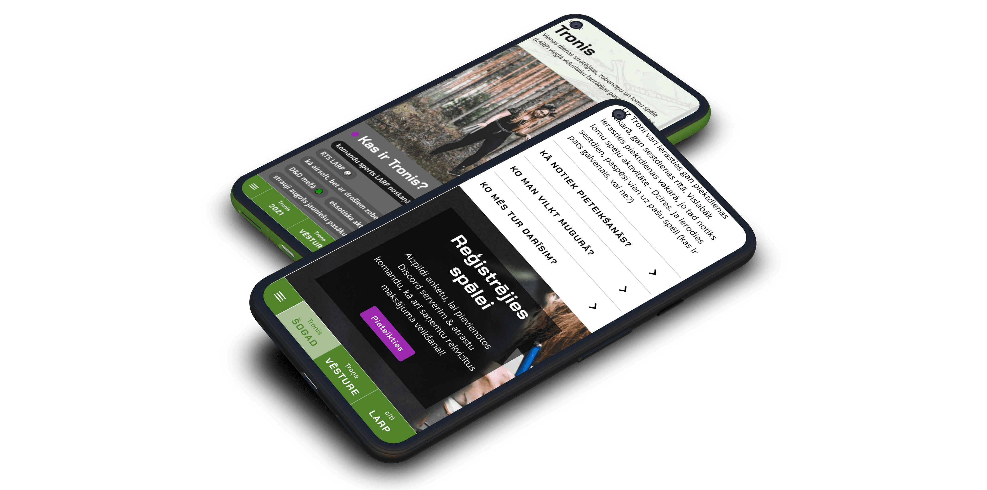
Key Throne website UI elements that convey being robust, inclusive and contentful.
After I had created the basic UI elements, my UX design mentee livened up the design with watermarks from game photos that greatly increased the role-play mood within the design.
Results
The Throne website fulfilled its main goal and provided an organized info about LARP Throne in one place. It also enabled LARP Throne to reach a wider audience and increase the number of participants by 20%.
Website traffic spiked at launch and right before the game at 250 visits per day and was significant during all 6 weeks of the Throne sign-up campaign until the game.
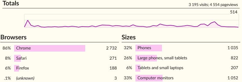
Publicly available and privacy conscious Throne website analytics.
User feedback
“I feel at home!”
“Even though I am an experienced LARP player, I really enjoyed the simplicity and how straight forward the website is.”
To measure the website’s quality, in a post-game feedback survey we evaluated the website’s main goal - informing participants. We found that despite the positive feedback about the website, our target audience prefers chat over website.
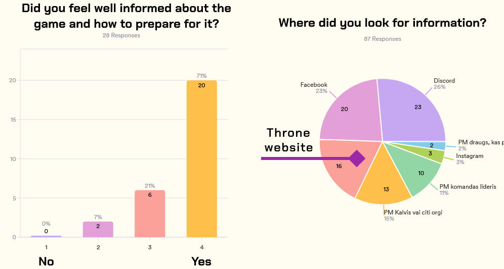
Left: the vast majority of players felt well informed about the game. Right: website is the 3rd most popular information source.
Final design
In the process of LARP Throne website design, I:
- mapped 11 user scenarios;
- formed the information architecture;
- prototyped 57 wireframes;
- designed 32 screens;
- facilitated 4 usability tests;
- wrote content for 34 pages (~7000 words);
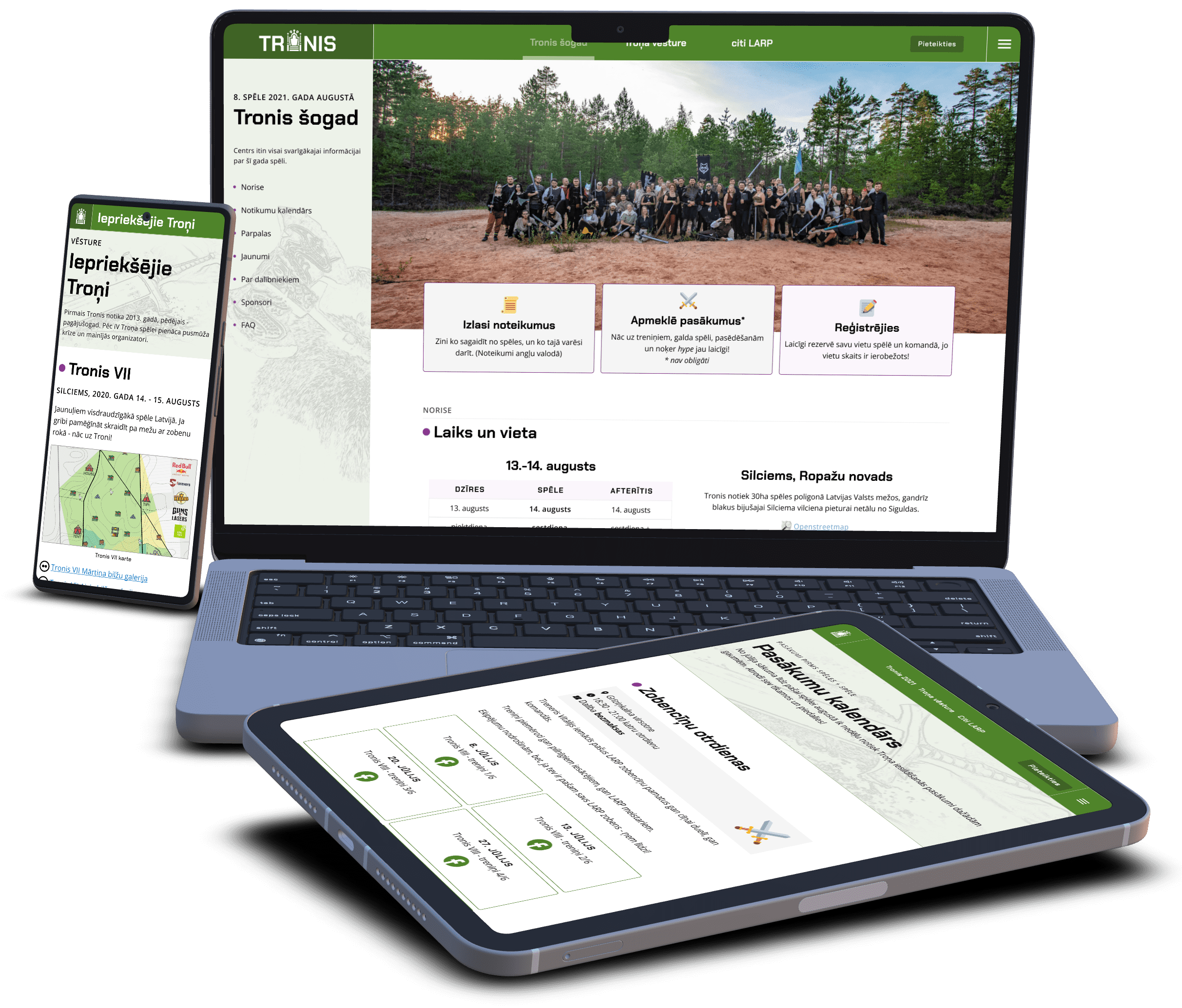
LARP Throne website design.
Main challenges and lessons learnt
The main challenge was a wide audience. The users vary from experts to encountering LARP for the first time. This disparity lead me to scrupulously test content with users and adjust it many times.
From a UI design perspective, the toughest part was responsiveness - adapting the layout for various screen sizes, especially tablet. I took special care to make sure that people in photos don’t have missing heads in any screen size.
Through this project I not only designed the website, but also mentored an aspiring UX designer. I found out how much work goes into delegating meaningful and knowledge appropriate tasks in each design phase.
This project taught me the value of content-first approach. By writing content at the same time as prototyping, I considerably decreased the amount of re-do’s during final design and development.
See the live LARP Throne website at tronis.lv.
All device mockups created in Device Frames.
