Sectoral Expert Councils (NEPs) have difficulty utilizing data. They are co-operation bodies that aim to advance vocational education to accommodate the labor market, but the available statistics are scattered across various sources. An easy-to-use summary would help councils make more data-based decisions.
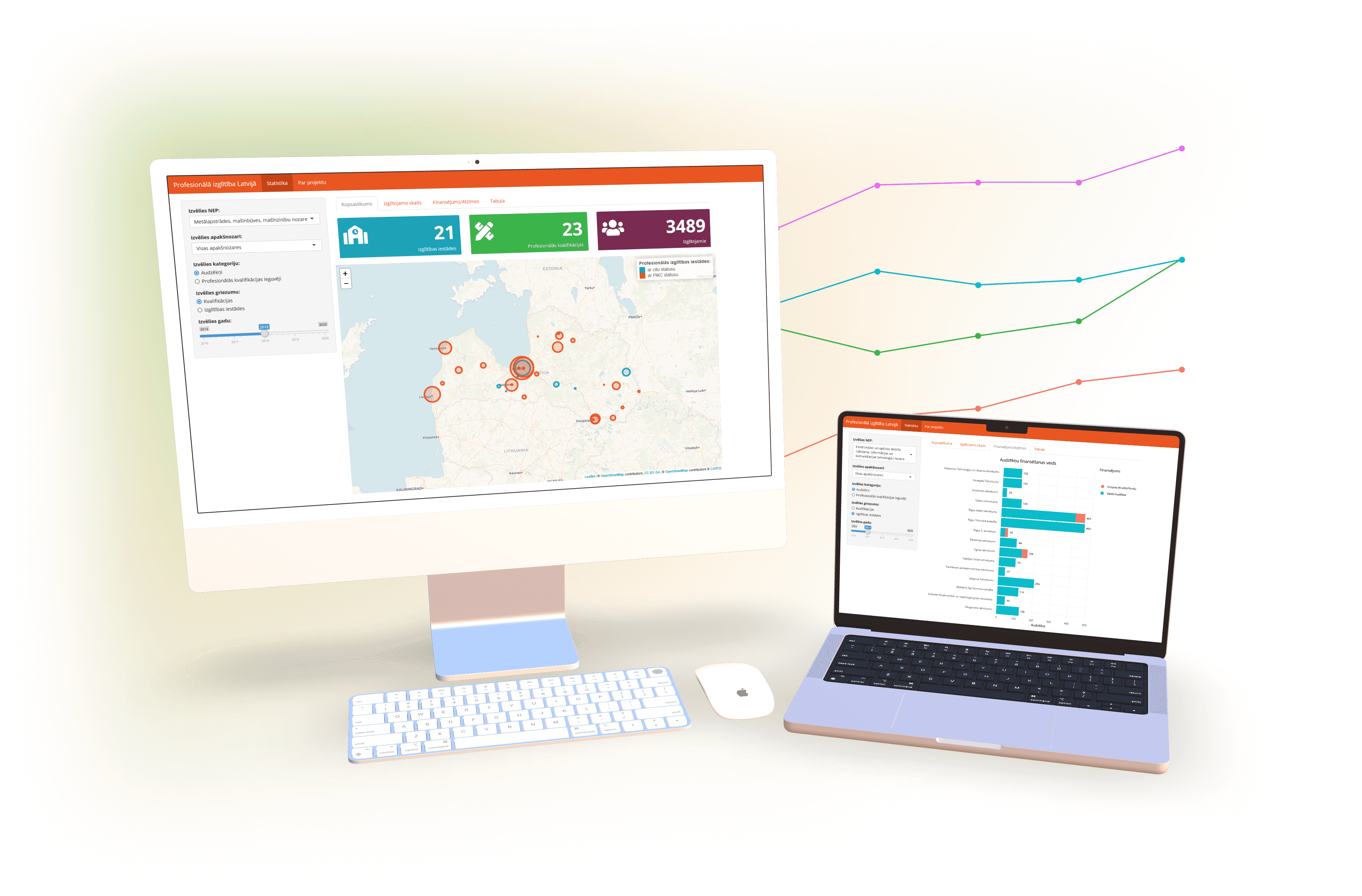
NEP parent institution Employers’ Confederation of Latvia set out to create a data tool about vocational education in Latvia for them. Through user experience design, data wrangling and development, we created a solution that helps expert councils gain insights in the future of the labor market within industries.
With the help of an experienced mentor Pēteris Jurčenko I designed, prepared data for visualizations and developed the data tool. Industry Expert Council coordinators provided user insight, valuable contacts and support. My developer colleagues helped with deployment and maintenance.
Business requirements
Sectoral Expert Councils (NEPs) are tripartite cooperation bodies of the State, employers’ organizations and trade unions that are coordinated by Employers’ Confederation of Latvia (LDDK). As industries vary widely, each industry group has their own NEP.
NEPs aim to include industry leaders in the policy-making of human resource development. LDDK is committed to create a data tool to summarize and present vocational education data in a way that is relevant for industries.
Together with my mentor we interviewed the main NEP coordinator to understand the goals of the data tool.
Data tool goals:
- Show the full status of professional education from an industry angle.
- Validate the efficiency of historic decisions.
- Provide support for future analysis of education institutions or programs.
The research
Vocational education policy-making is an intricate field with many stakeholders. I worked on user and data research as both were equally important to design a useful data tool.
Research goals and their success criteria:
- Understand the field: Immerse myself in the vocational education policy-making, so I can freely explain what NEPs do.
- Explore all data: Set my hands on every vocational education dataset, so no industry expert can surprise me with an unfamiliar dataset.
User research
First, we created user personas and scenarios to specify our main task. With the help of Pēteris, I interviewed NEP coordinators to frame specific agendas (scenarios) when users (personas) would use the data tool.
Second, I spent time within the NEP community. I attended the monthly meetings of various industry NEPs and the yearly NEP seminar/conference and kept up with the vocational education news. This gave me a good idea of the context and immensely deepened my understanding of their work.
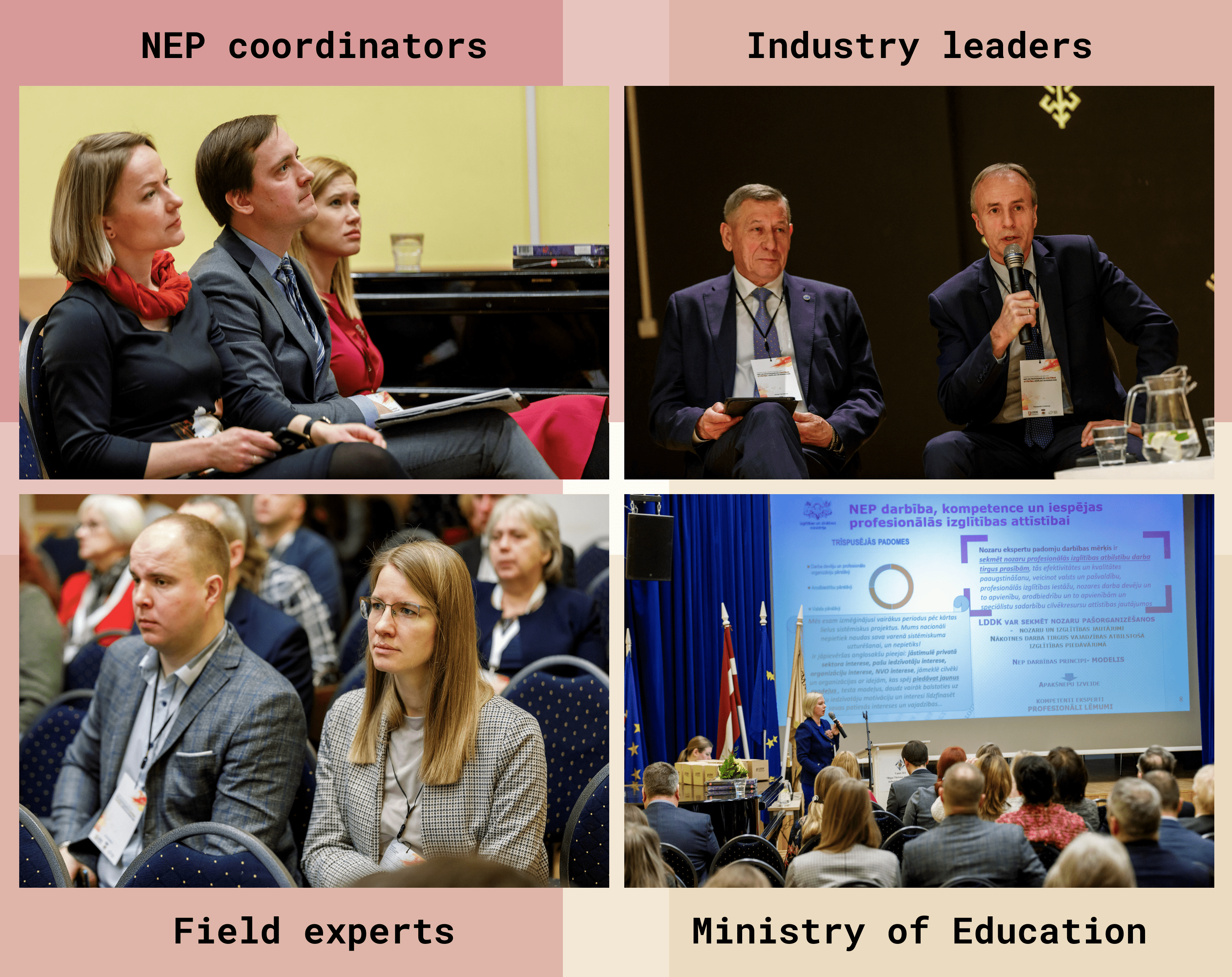
Users of the data tool in the yearly NEP seminar/conference, divided by personas.
Data research
With the help of NEP coordinators and creative ideas from my mentor I sourced, cleaned and transformed 10+ public and private datasets until I could answer the underlying questions from user scenarios with data. For example:
- Which education institutions provide the highest quality of education?
- Do many students pay for their studies?
- Do students choose to study in regions or at the capital?
Some of the user scenarios are very industry related. As no existing sources could provide the distinction between industries, we categorized data by industries on our own (see filters in purple below).
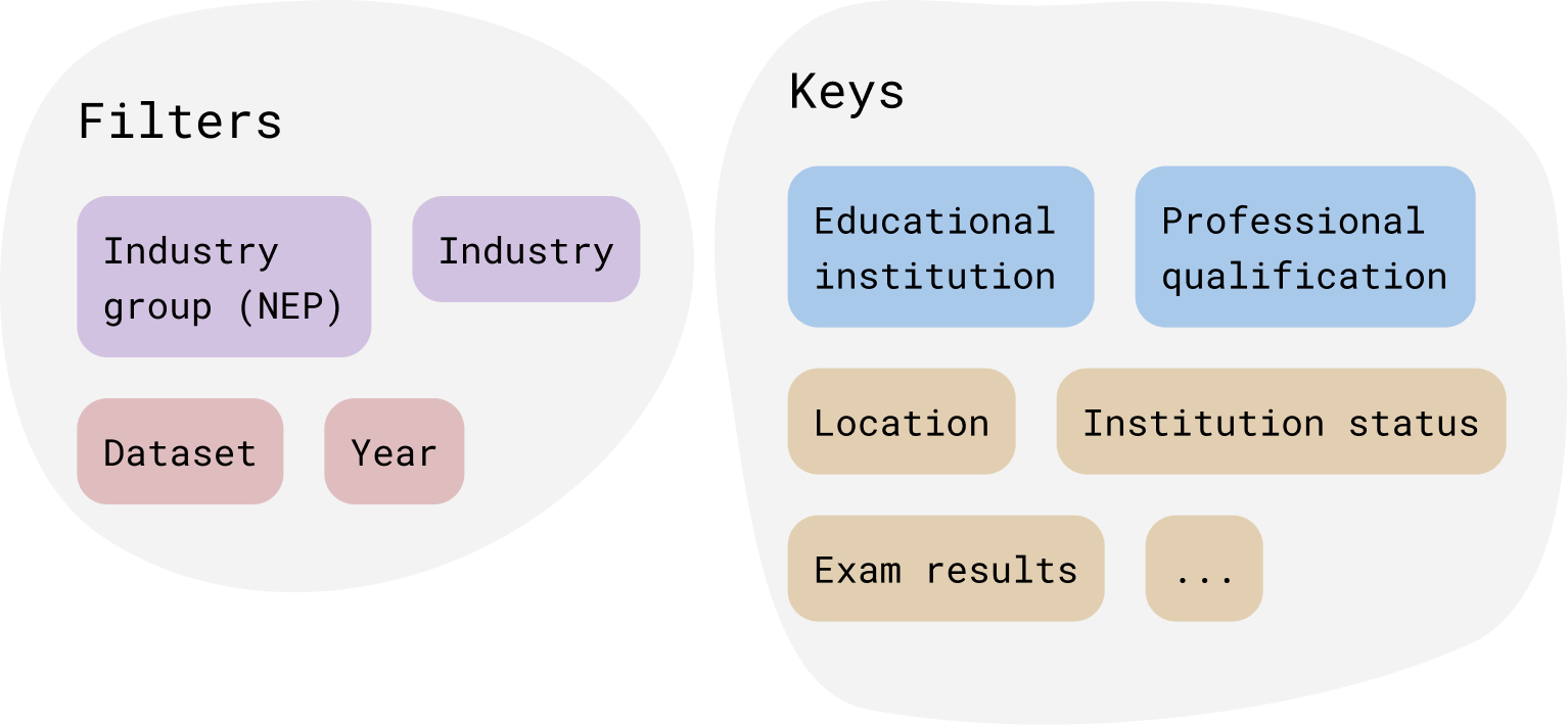
The filters and keys from the datasets. The keys in blue are must-haves - without them a data source can't be combined with others.
Design
This is a data heavy design, so I studied the best practices, prototyped various designs and tested them on the target audience.
For all operations with data we used the R language for its wide data wrangling and visualization capabilities and the possibility to create a web app using pre-made themes.
Data visualizations
The emotional impact of data can be manipulated with alternative framings, so I made sure to use appropriate data visualizations from the R graph gallery. They provide good explanations when and why to use different charts.
An example
The qualification exams are the perfect dataset to answer a question from user scenarios:
- Which education institutions provide the highest quality of education?
To enable users to make conclusions about education quality from data, I deduced what is important to include in the chart:
- What’s the average grade? (the mean and median grade);
- Is the data statistically significant and so - reliable? (how many data points are there?);
- Do all students get the same grades? (how wide is the spread?).
As a result, I chose to use boxplot with a few tweaks - adding the individual data points (light grey dots) and the mean (blue rombs).
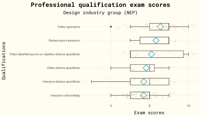
An example of a quality of education chart in the design industry group.
From this chart users can conclude that video operators have the highest professional education quality in design industries, because:
- On average they have the highest qualification exam grades;
- There are enough data points to make conclusions.
In contrast, assistant restorers (the second boxplot) also have high grades, but there are not enough data points to make conclusions about them.
The layout
As the development of the tool was an iterative process, we tested various layouts and improved the design from user feedback.
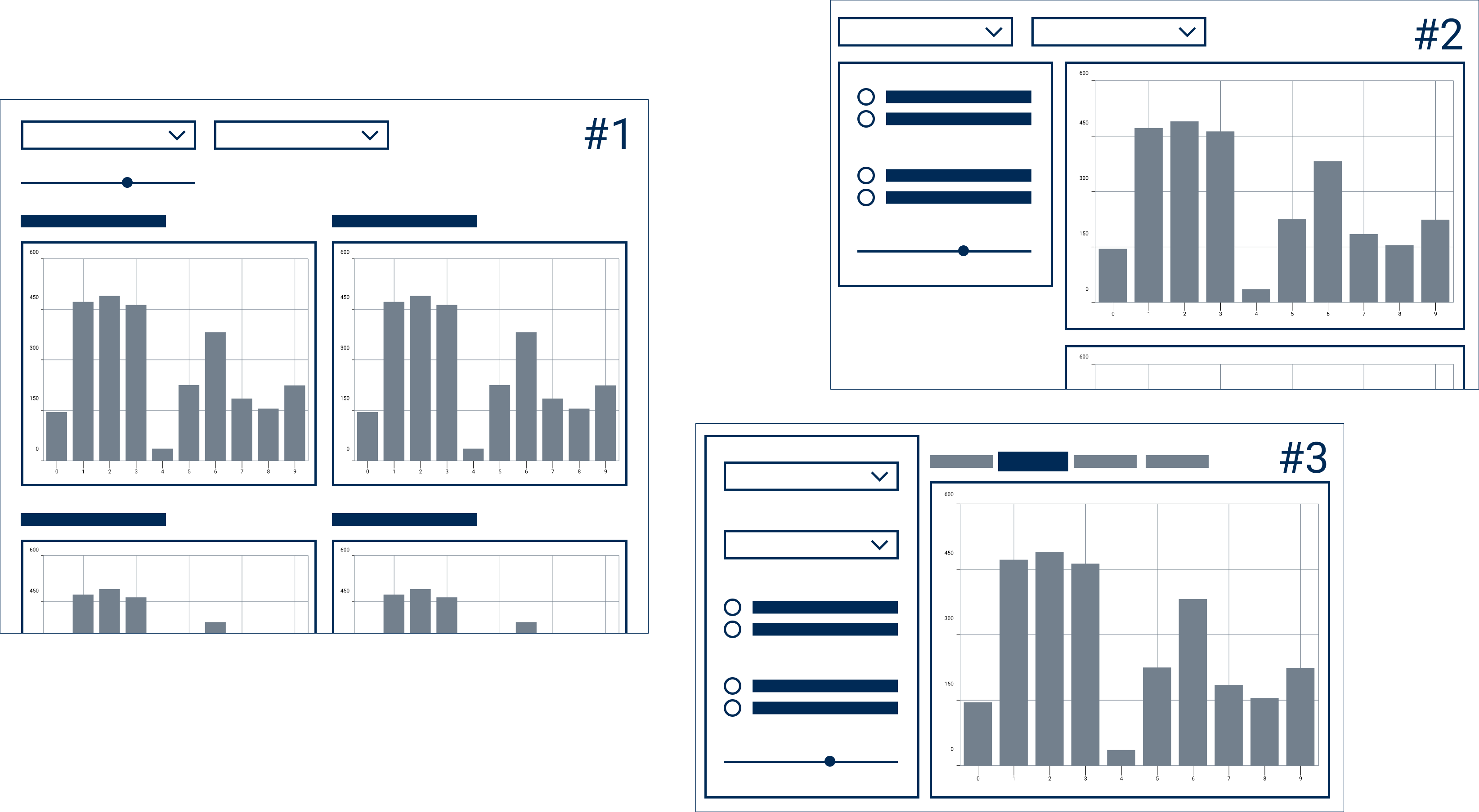
Layout sketches. They differ by the order of information and the amount of charts on a screen.
During the development I tried out all 3 layouts. We kept the #3 layout because:
- User feedback showed that users could focus only on one chart at a time;
- Tabs gave a good overview of what to expect;
- A sticky sidebar grouped filters in one place.
Result
During the project, I:
- Designed 5 data heavy screens;
- Made 3 layout iterations;
- Transformed the research of 10+ datasets into user centric charts;
- Developed the data tool.
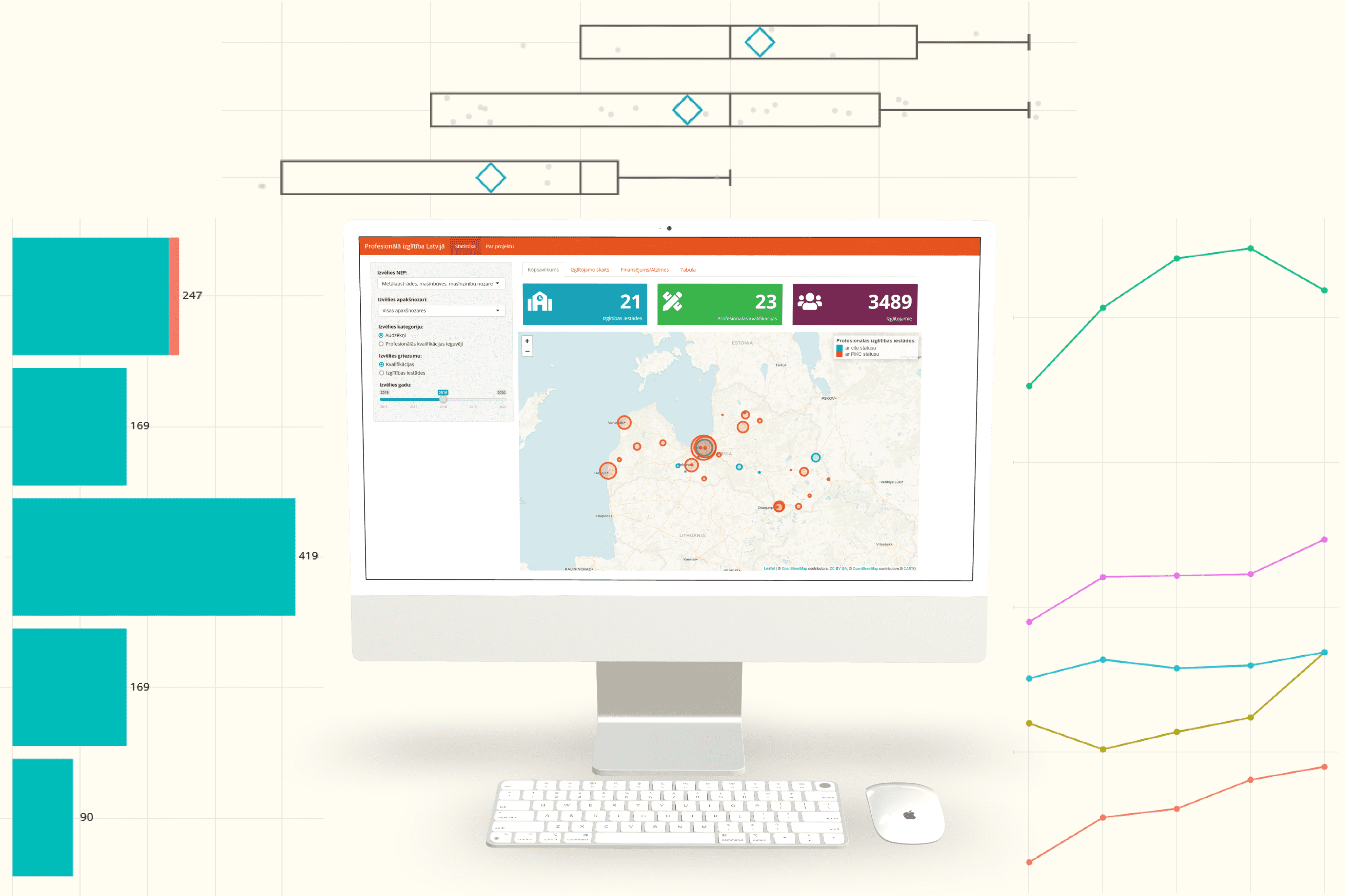
The professional education data tool and the chart types used in it. See it live at nep.lddk.lv
Outreach
I had the opportunity to present my findings about the state of education data to the Ministry of Education and Science. Data analysis results (data table, charts and source code) were made available to the ministry for review and with a hope that the data could serve as a starting point for a broader summary of education in Latvia.
Main challenges and lessons learnt
The main challenge of this project was the data itself. It was hard to collect any and the data we did gather turned out to be scarce and with varying quality. Luckily, I had industry experts who helped me uncover the data sources only insiders have access to.
The toughest and most rewarding part for me was to create informative and user centric charts.
This project taught me how to structure data for long term use. Cleaning data is hard work and I have a newfound compassion for data scientists and analysts who create value from data on a daily basis.
See the live data tool at nep.lddk.lv.
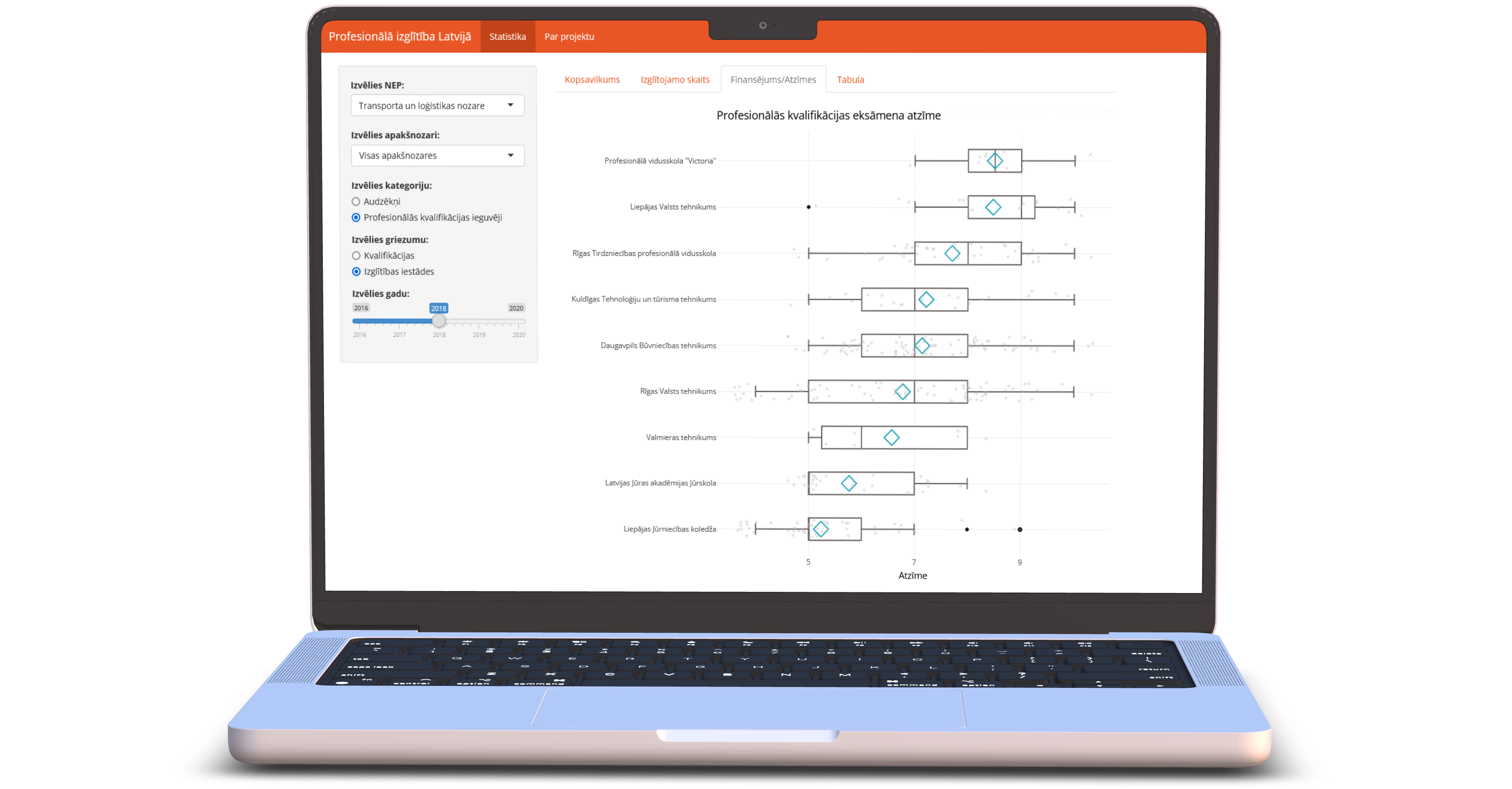
All device mockups created in Device Frames.
