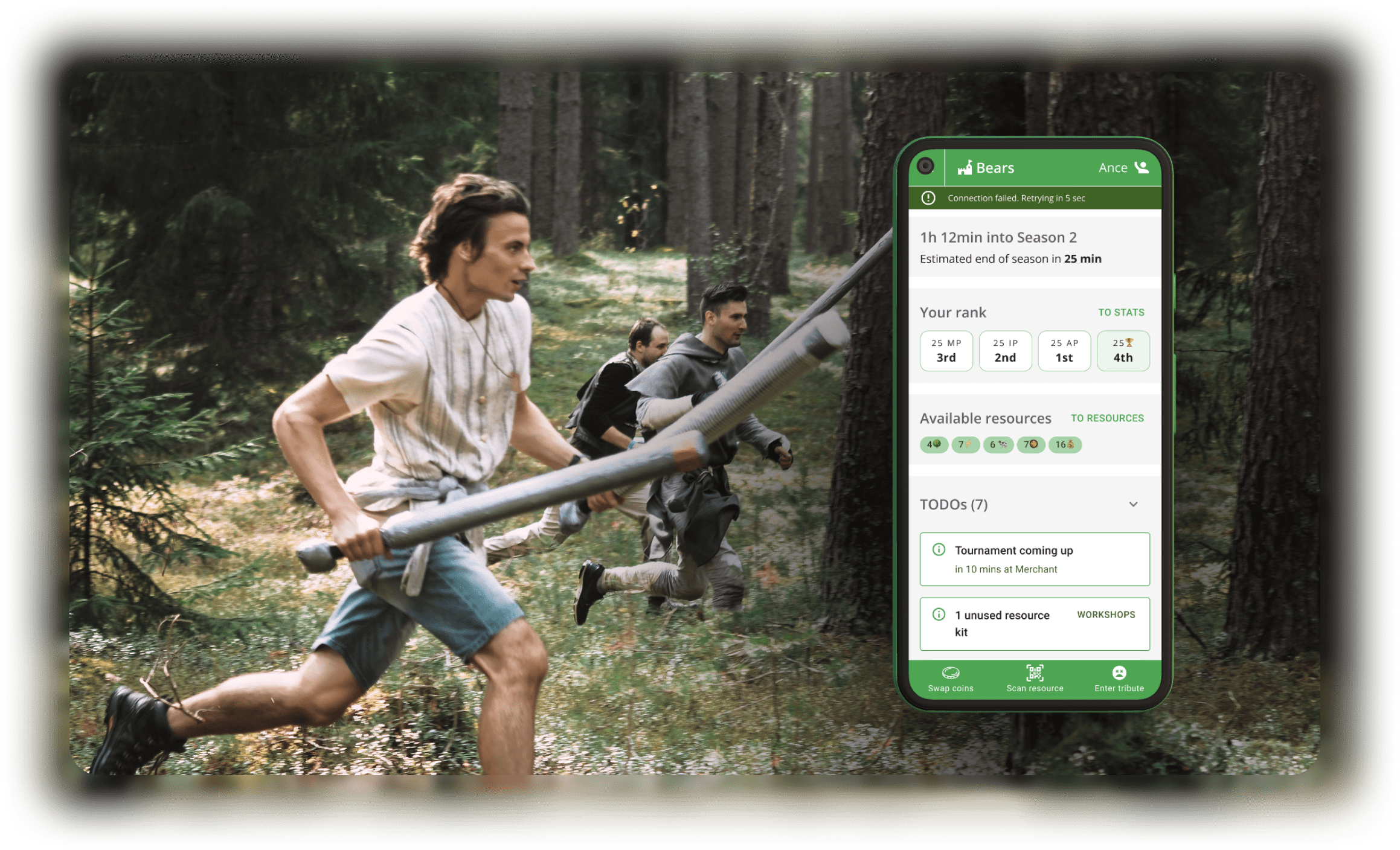
Main outcome: I designed a web app that is used as a part of a medieval Live Action Role Play (LARP) game in the forest.
LARP Throne is a strategic game based on an elaborate economy. The downside of it is that someone has to do an overwhelming amount of math manually. If it’s automated, participants could spend more time on the entertaining activities.
The organizer team set out to create a Throne game web app. Through user experience (UX) design and development, we created a robust and accessible app that impacted every part of the game.
I created all design deliverables for the app. The game creator acted as my partner and provided context and feedback. Our developers implemented the entire project while I helped them with coordination and quality assurance (QA).
Business requirements
LARP Throne is a yearly event, attended by 50-100 people. It is organized by 8 enthusiasts with the help of ~20 more volunteers. Throne aims to be a real time strategy game with role-playing and sword-fighting elements. Organizers are committed to integrate app functionality in the game and develop the app on their own.
I interviewed the game creator and through a design brief and a business needs document grasped his vision of the app’s place in the game.
App goals
- Have an affordable development and maintenance
- Be easy to use for every participant
- Expand real-time strategy game mechanics
I translated the business goals into attainable objectives and validated them with the client. Insights from these conversations led me to high level priorities.
Priorities
- Dive deep in UX design to reduce the amount of decision making and remakes during development.
- Focus on user research to deeply understand the app usage during the game as it is very specific: short sessions on 1-2 mobile devices per team throughout the whole game by distracted players.
- Negotiate game rules improvements to make the app’s logic and UI more intuitive. That would ease interactions with the app for every player regardless of their role in the team even if they have not read the game rules.
The problem: who does the math?
During the game, players compete for resources placed around the forest. They bring physical tokens to their team base where teams spend resources to gain goods, effects and victory points.
Every action involving resources includes some degree of math. Players like the strategic angle the economy enables, but they despise the manual calculations.
Failed attempts
In the previous Throne games we tested various solutions. Approaches relied on dedicated players or organizers who were locked in the team camps performing manual calculations. These people gave mostly bad feedback on their role and were unlikely to return next year.
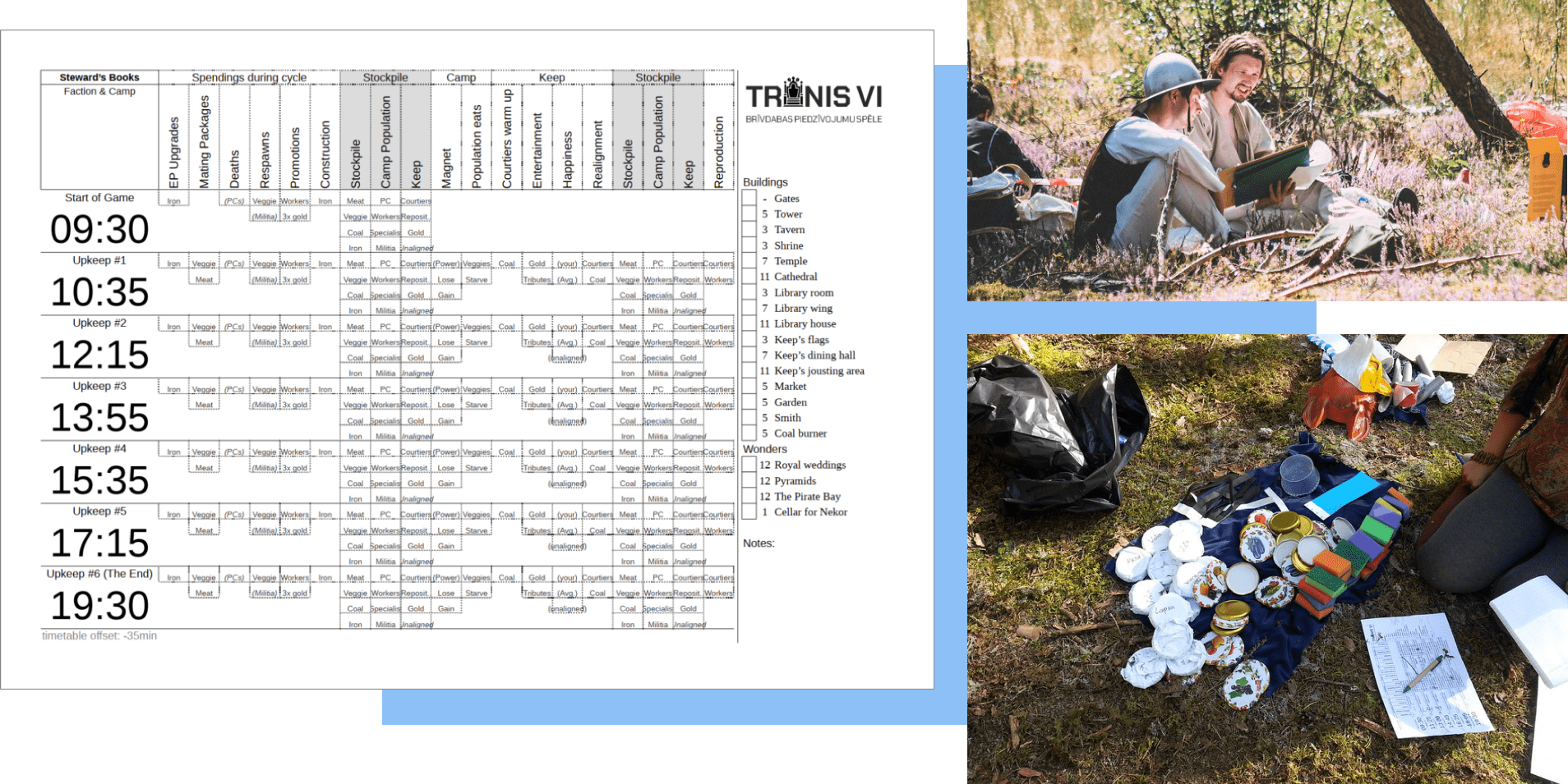
A dedicated player in each team does manual calculations on a sheet of paper.
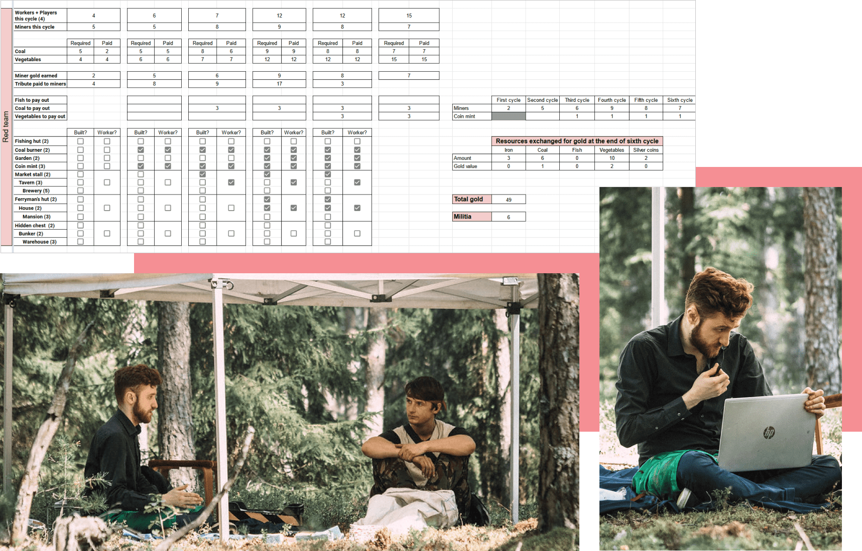
A dedicated game master in each team camp executes teams economic decisions in an online spreadsheet.
User research by roles
With the help of the game creator, I created user personas and storyboards to gain a deep understanding of users of the app.
I made an affinity map to create structure and navigation of the app. We voted with dots to find out what are the most important user flows and what to make first.
User personas by role in team
As long-time Throne organizers, we already knew the players pretty well. But the app will change the game, so we took the opportunity to design new team dynamics.
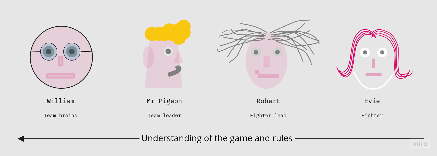
An overview of the user personas - imaginary and a bit stereotypical people that could be players of LARP Throne and use the app.
The personas are divided by roles in the team. And roles are mostly divided by their knowledge and understanding of the game. For example:
- Evie is a newbie in LARPing, she knows very little about Throne and does not even know the game has rules.
- William is an expert, he has participated in more than 1 Throne. He usually studies the rules before the game with extra attention. He comes to games with a strategy in mind.
List of the essential user flows
As the next step, I and the game creator listed all possible interactions that could become user flows in the app.
We sorted all stickies to personas by asking one of the two questions:
- How well do you need to understand the game rules to be able to perform the action?
- Which role is the most likely to perform this action?
After that, we found the ouliers by dot voting: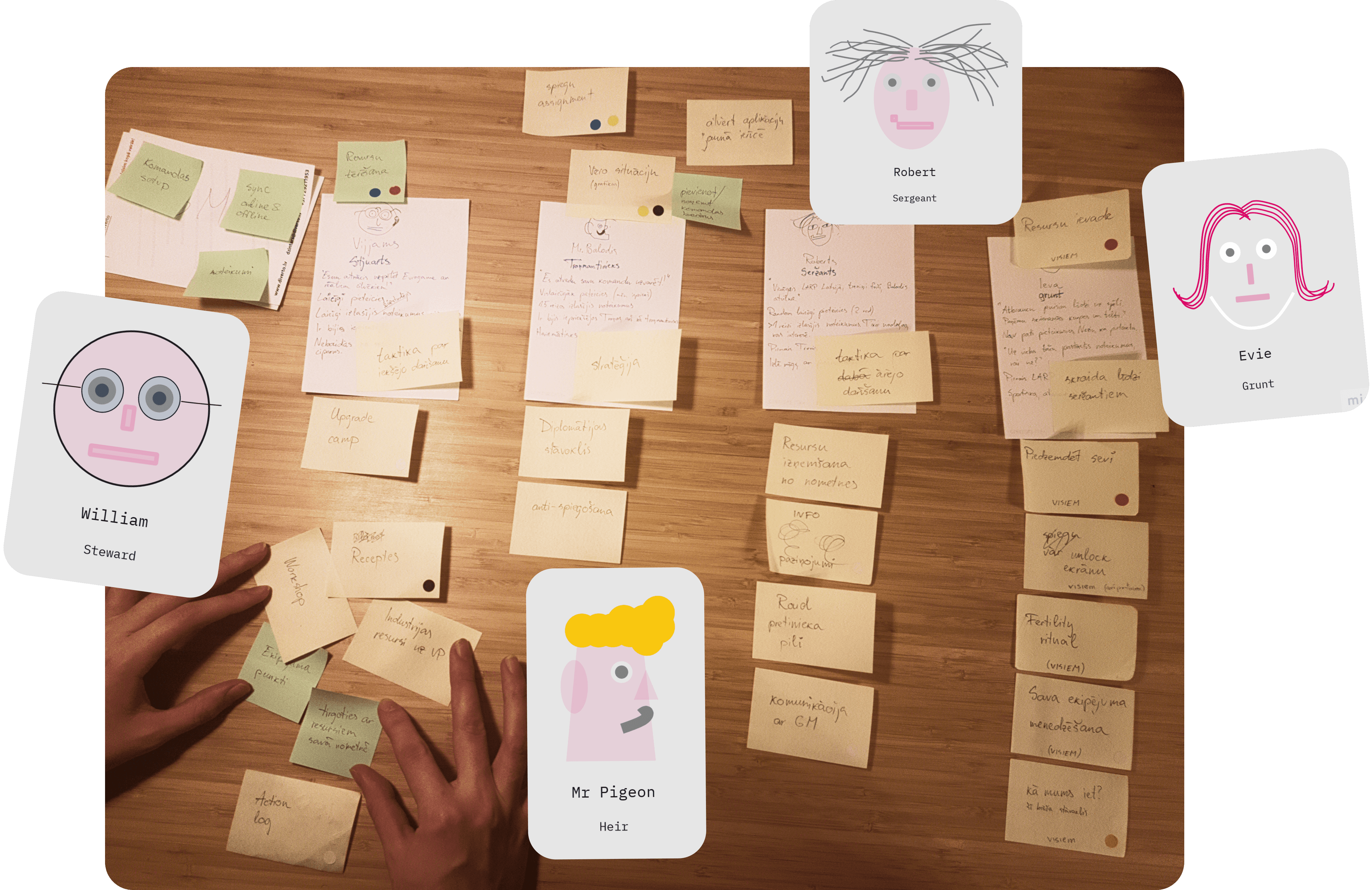
User flows sorted by roles. Dots are added to: the most/least important; hardest to make; with the most unknowns.
Dot voting helped to reduce the number of user flows from 31 to 22. I removed the inessential and those who do not make enough impact for the time invested.
A clear scope and priorities
After I sorted all user flows by personas and colored by priority, I got a full understanding of the amount of work (22 flows).
To use personas as a reference in the next design steps, I color coded user flow stickies by priority:
- red - critical
- green - a must
- dark yellow - good to have
- light yellow - if we have enough time

A bird's view of all user personas with their supporting information: character, how they will spend time in the game and what will they use the app for (user flows).
The most important insight was that QR code scanning is the most important action that needs to be built and tested first.
Storyboards for the most important user flows
I pushed the rules creator into the games and comics land. Together we drew storyboards to align our views for the most important user flows.
Resource input storyboard
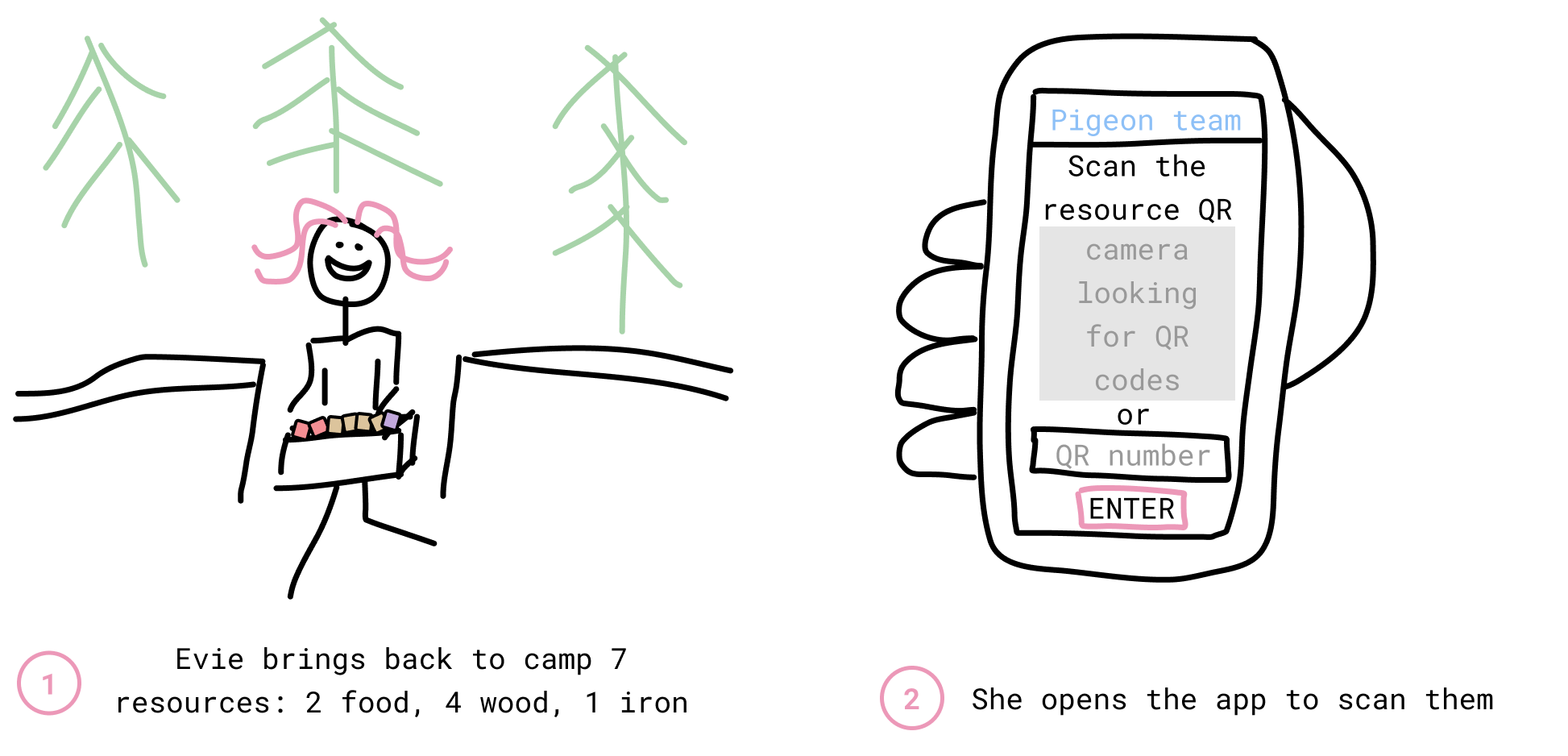
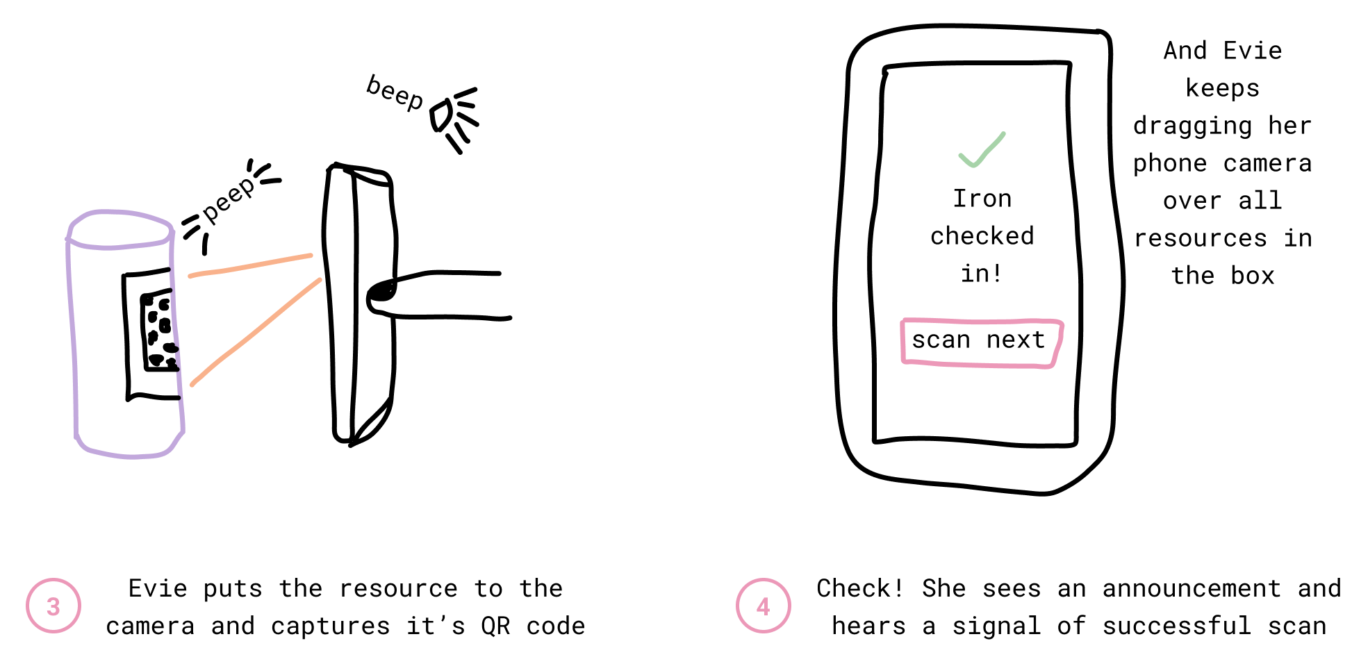
Storyboard - a short story/comic about a user flow (here - resource input). It consists of specific steps the user is making in the situation and is great for understanding the context.
Now the context of how and when the app will be used was clear:
- in a busy team camp,
- by people in a rush,
- via bad bandwith,
- possibly in rain and bad lighting,
- using broken phones.
It is here that I decided to do everything in my power to make the app accessible: high contrast, big letters and great copy.
UI: From prototypes to final design
The hardest part of user interface (UI) design was to come up with a consistent and beautiful concept. I made a design guideline and several prototype iterations of each flow until all major problems within designs were solved.
Prototypes: quickly test ideas
In the order user flow priority, I reviewed the storyboards and started visualising possible UIs:
- Paper prototype: Sketch ideas on paper.
- Digital mockup: Draw the best ideas digitally with basic components.
- Final design: Review, test with people and refine using the Throne app UI style.
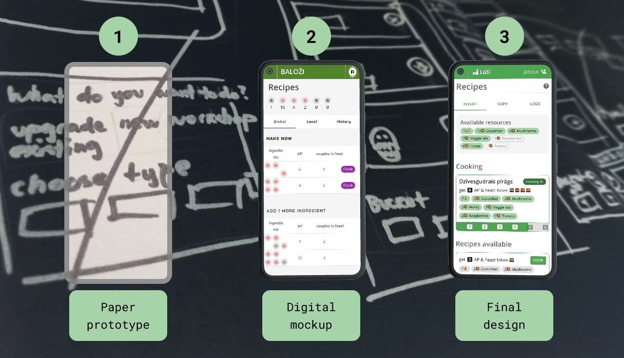
User interfaces from start (paper prototype) to finish (final design).
For digital prototypes in Figma I used UI components from Material UI library and some of the Throne webpage design components. I quickly realized, that I need to figure out Throne app’s own design style ASAP to avoid double work by drawing the same screens twice.
User interface design guideline
To align team’s expectations of interface design, we agreed on a guideline using levers:

The guideline of Throne game app design: compact, very functional, dense and evenly.
The guideline was a big help in decision making for visual style. For example, I chose to use only one font - Open Sans, to keep the UI simple. I also decided to use rather small headings and minimal spacing to align with our guideline.
Color by team
In the game each team has a totem animal - they worship it with a flag and dessing similarly. To make each team’s experience more personal, I made app’s interface using a different color for each team. We nudged teams to integrate the color in their flags and dress.
The colors were chosen very carefully, using this criteria:
- distinct: so players can easily name each color
- enough contrast with white and black: for readable text
- all with equal saturation: to enable using light and dark shades for each color
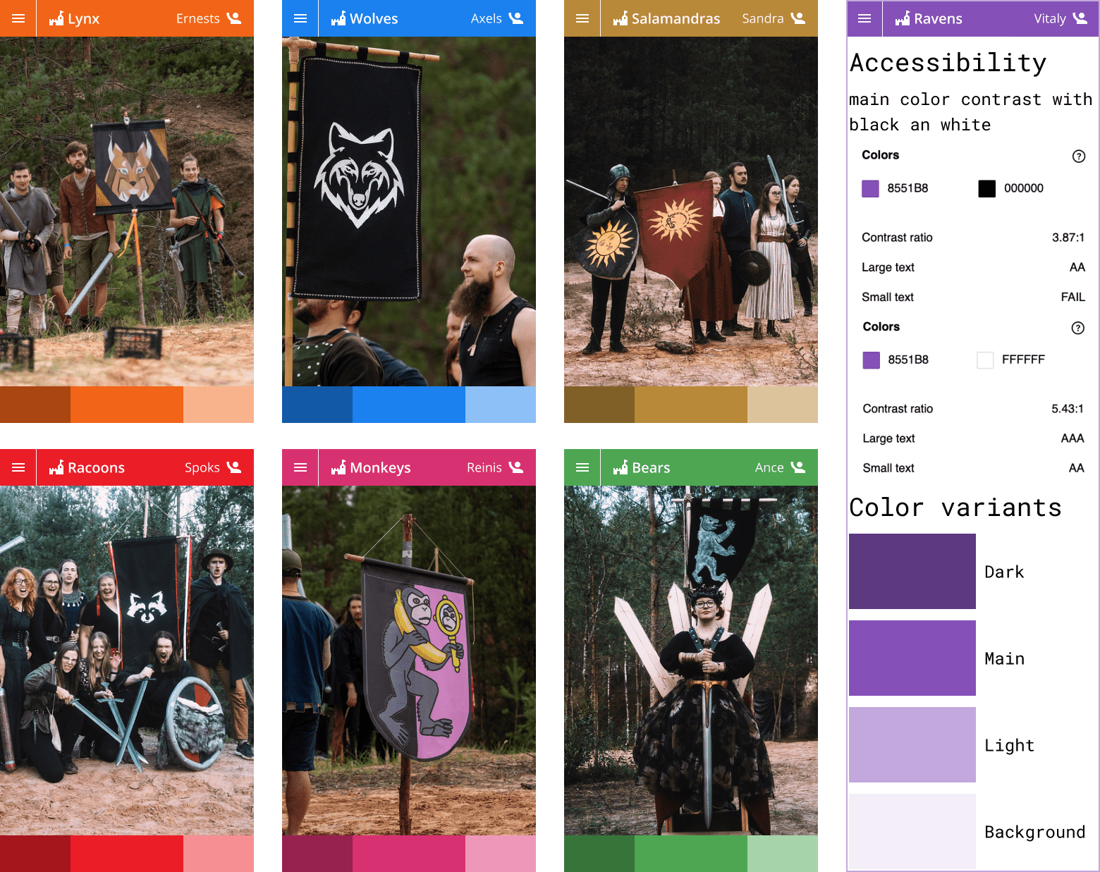
Each team's flag and app interface color for the team with light and dark shades. Each color is deliberately chosen with accessibility in mind.
Usability tests: as early as possible
As I finished designing the first user flows, I jumped at any opportunty to test the app’s usability.
First usability tests in Throne social events
Throne app usabilty tests were very informal. In usability tests I sat next to to-be LARP Throne game players looking over their shoulders while they clicked through a Figma prototype.
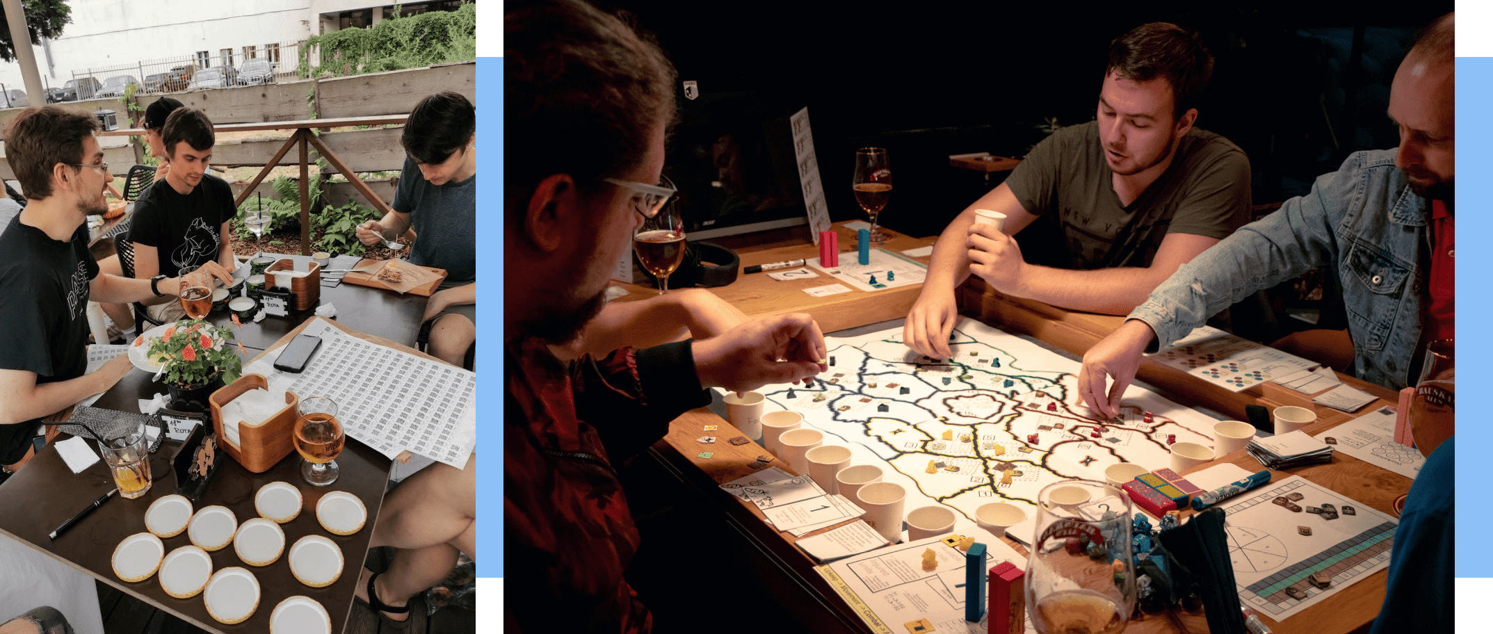
LARP Throne pre-game mingling and boardgame events where I facilitated the first app usability tests.
Tests in real life situations
All summer before the game we held sword-fighting practices. So, we developed a very basic version of the app and tested it in a game-like situation.
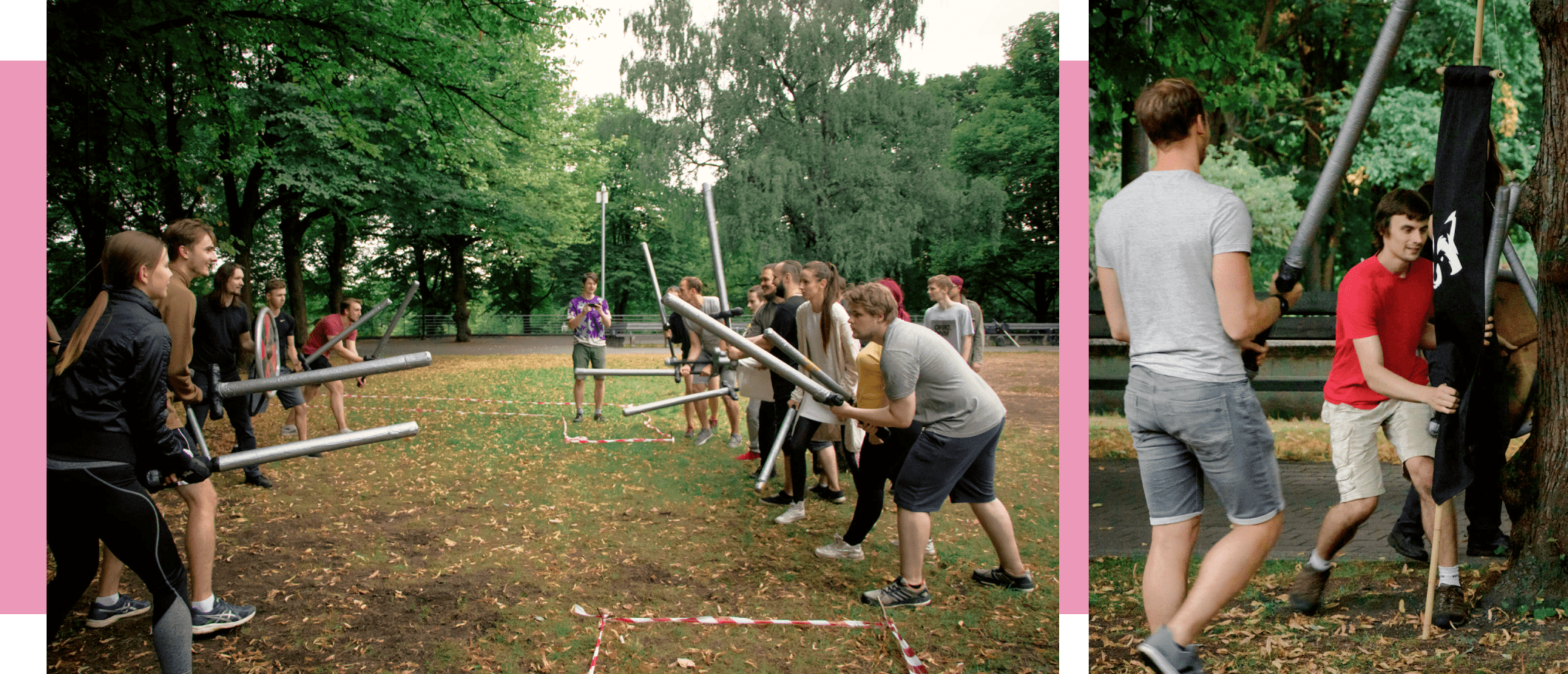
LARP Throne sword-fighting practice. Wounded people have an opportunity to respawn through the app.
Usability tests assured me that the idea works
After ~5 tests of the first 3 user flows, I was confident I am on the right track:
- Does the user understand the idea within the first 2 minutes?
Mostly yes, but the differences with previous Thrones create confusion. Nevertheless, all users find it easy to navigate and easily grasp new concepts. - Can the user successfully finish the flow?
Mostly yes. The situations they could not was due to the Figma prototype limitations. - Does the app helps the user understand game rules?
Yes, their mental model was very close to the design idea.
Tests also revealed actionable information. For example:
- Players don’t remember game rules.
Solution: add a button of corresponding game rules in every page. - Web browser navigation hides parts of the app.
Solution: change the layout to fit web browsers both with upper/bottom and pinned/hidden navigation.
Usability tests also prepared players to the game. They were beneficial to both design and players.
Results
The Throne Game App fulfilled it’s main goal and put an end to manual calculations during game. It also enabled LARP Throne to scale - the need for volunteer game masters per game is reduced by 50%.
In the process of Throne app design, I:
- created the app information architecture;
- produced 100+ wireframes;
- prototyped 22 user flows;
- facilitated 10 usability tests;
- copywrited ~10 000 words;
- optimized the design for development by utilising reusable components.
Final design
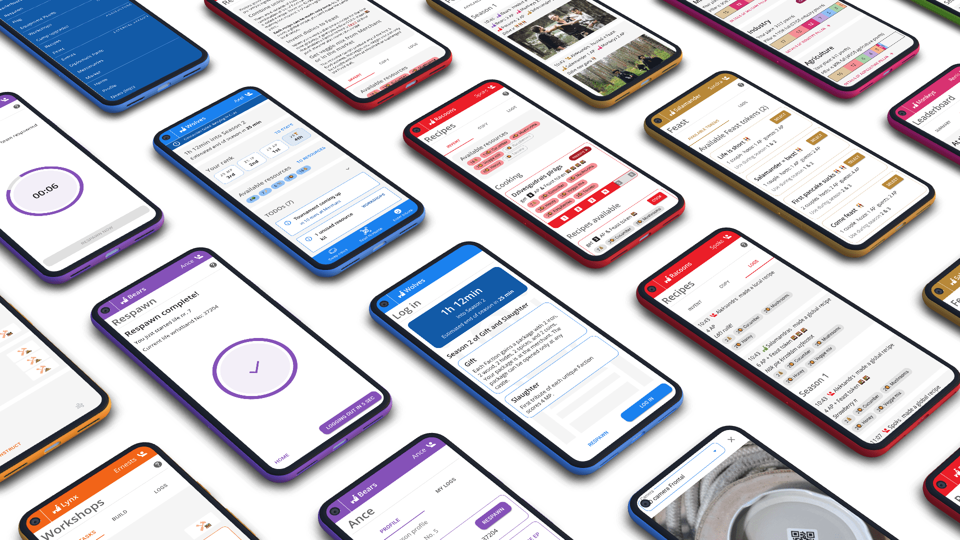
Screens of the final design in team colors.
Interactive prototype
A clickable Throne game web app prototype. Warning: be patient - it may lag.
The game
On a rainy August 14, 2021, 60 people met for LARP Throne and had a great time. Players ran, fought and backstabbed. They used Throne game app to collect resources, strategize, track progress and more.
I squeezed my opportunity and observed app users. I visited all 6 team camps, helped with their misunderstandings and gathered feedback about the app.
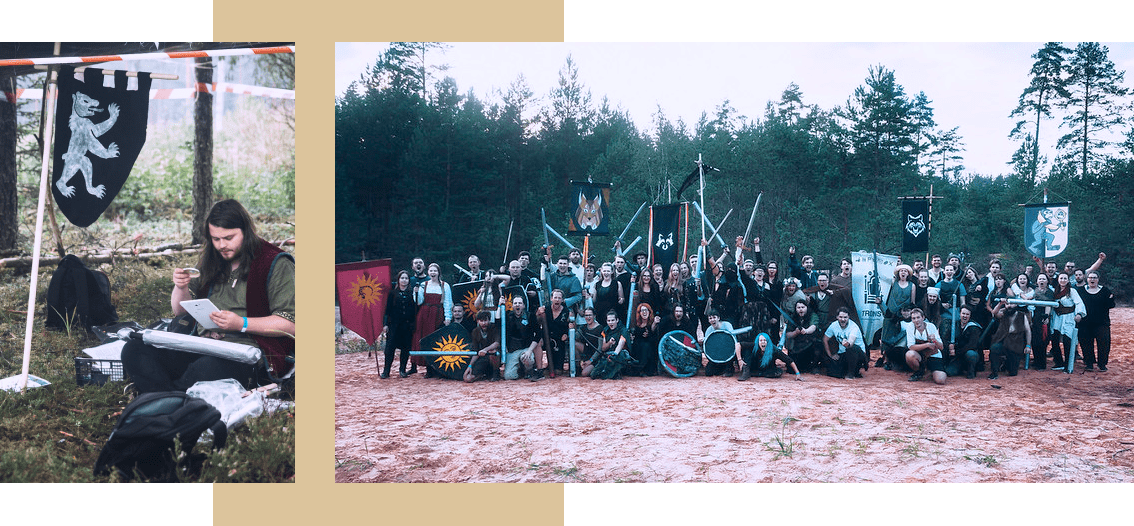
Left: player in team camp using the app during game. Right: all participants of LARP Throne.
User feedback
In a post-game feedback survey, we found out that most respondents think the app adds value to the game:
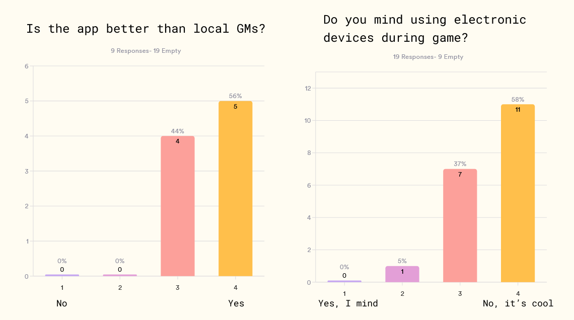
Left: Most respondents think that app is better than local game masters. Right: Most respondents are OK with using electronics during a LARP.
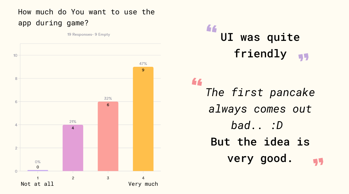
Left: Most respondents want to use the app themselves during game. Right: Freeform comments about the app.
Main challenges and lessons learnt
The main challenge of this project was its novel concept - add a digital dimension to an in-person real-time strategy LARP game.
Personally for me the toughest part was to create a constructive design concept and test ideas. So I did a lot of research. Most notably, storyboards yielded the highest value.
During this project I learned the value of pixel perfect design. By adding detail and asking hard questions during design, we solved problems early and saved time on decision making during development.
Next steps
Before the next LARP Throne in summer, I plan to:
- create a custom icon set for the game resource types;
- update log in and resource scan user flows to align more with user needs.
LARP Throne will continue to evolve. The next step in its evolution is to test the app in less stressful circumstances. To do that, we are preparing a smaller mini-Throne before the yearly game in summer. You are welcome to join us!
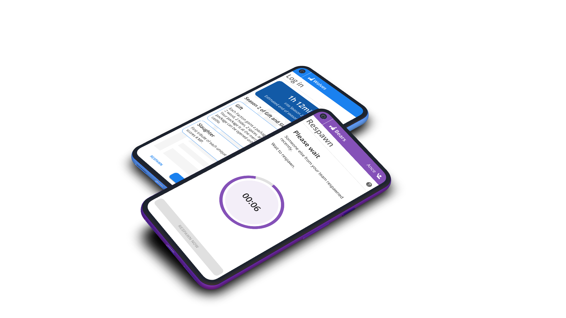
All device mockups created in Device Frames.
